
The Booth That Made Us Stop at PRINTING United Expo
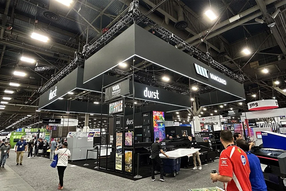
Some booths try to win the show floor with more color, more motion, more screens, and more noise.
Durst went the other way.
At PRINTING United Expo, their booth caught our eye because it felt calm, confident, and seriously polished. In a hall full of brands fighting for attention, Durst stood out by keeping things clean.
Black and white. Strong structure. Crisp branding. No clutter.
It looked elevated without trying too hard.
Quiet Confidence on a Loud Show Floor
Trade show floors are visually exhausting by nature. Every booth is trying to pull you in from the aisle. Every brand wants to be seen from across the hall.
That is what made Durst’s booth so interesting.
It did not scream for attention. It created presence.
The mostly black-and-white design gave the booth a professional, elevated feel. The branding was easy to read. The layout felt open. The equipment had room to breathe. Everything looked intentional.
For a creative director, that is the stuff that matters. Not just how a booth looks in a rendering, but how it feels when someone walks past it in a crowded hall.
What Made the Booth Work
A booth does not need to be complicated to be effective. Durst’s presence worked because the details supported the larger brand impression.
A few things stood out:
The black-and-white palette gave the booth a clean, premium feel.
The overhead signs made the brand visible from around the floor.
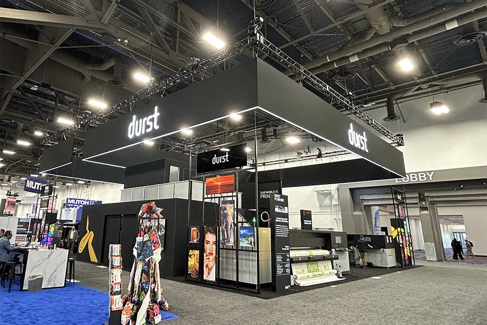
The SEG graphics looked sharp, finished, and architectural.
The lit edge along the bottom added just enough glow to catch your eye without feeling flashy.
The open layout gave the equipment and conversations room to breathe.
None of it felt accidental. The booth had restraint, but it still had impact.
The Overhead Signs Did the Heavy Lifting
The hanging signs were one of the strongest parts of the booth.
They gave Durst visibility from around the floor, but they did it with restraint. The SEG graphics looked clean and architectural, not soft or wrinkled like a loose pillowcase graphic can sometimes feel.
Then there was the detail that really made it work: the lit edge along the bottom.
It was subtle, but it pulled your eye in from a distance. Not flashy. Not loud. Just enough light to define the structure and make the booth feel finished.
That small detail changed the entire read of the space.
What Trade Show Creatives Can Take From It
There is a lesson here for anyone designing branded environments.
Clean does not mean safe. Minimal does not mean forgettable. Black and white does not mean boring.
When the design is sharp, the lighting is right, and the brand has enough confidence to avoid over-explaining itself, restraint can be more powerful than volume.
A few reminders from the Durst booth:
Strong branding does not always need loud color.
Overhead presence matters when the floor is crowded.
Lighting can create attention without adding chaos.
Materials and finishing details change how a space feels.
A great booth should communicate confidence before the first conversation.
Durst did not need to be the loudest booth on the floor.
It looked like one of the most confident.
Why We Notice This Stuff
At One Minute Print, we are always looking for the details behind the experience.
Sometimes it is the print. Sometimes it is the material. Sometimes it is the install. Sometimes it is the way a booth uses structure, signage, lighting, and restraint to make people stop.
Durst’s booth was a reminder that great trade show design does more than display products.
It creates gravity.
Have a Story Worth Telling?
The best print stories usually start behind the scenes.
If your shop, brand, booth, project, or process has a story worth sharing, we want to hear it. One Minute Print is always looking for the people and ideas shaping the future of print, from the show floor to the shop floor.
Your story could be a future feature on Fresh Ink or a conversation on the Shop Floor podcast.